
Designing a logo for a company that designs brands
As a branding-focused agency, The Branding Club’s own identity needed to clearly express its role as a creative partner.
The challenge was to design a logo that didn’t just look appealing, but actively supported the company’s positioning: approachable, creative, and hands-on, while remaining flexible enough to live across marketing and promotional materials.
Creativity as a visible core
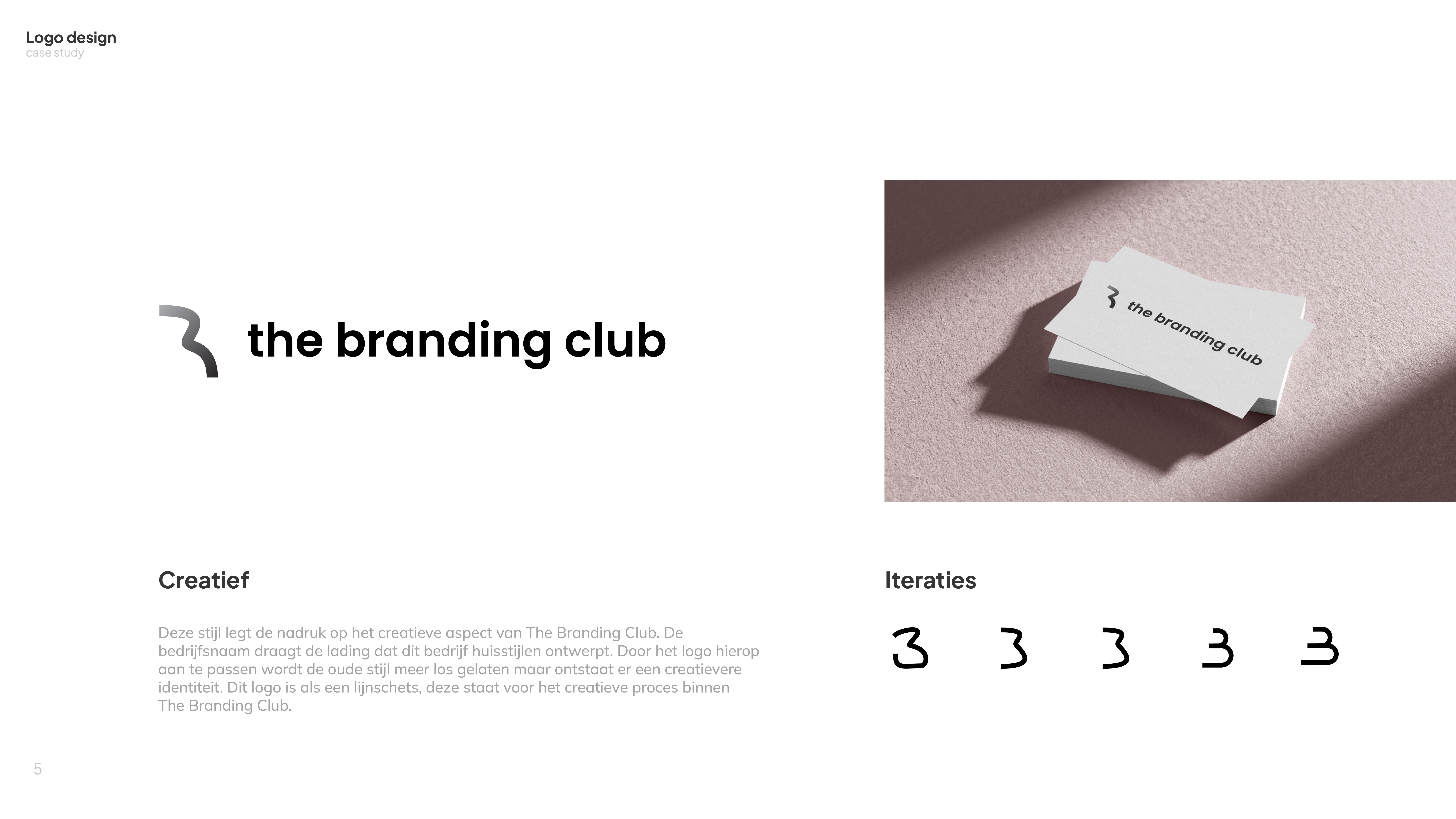
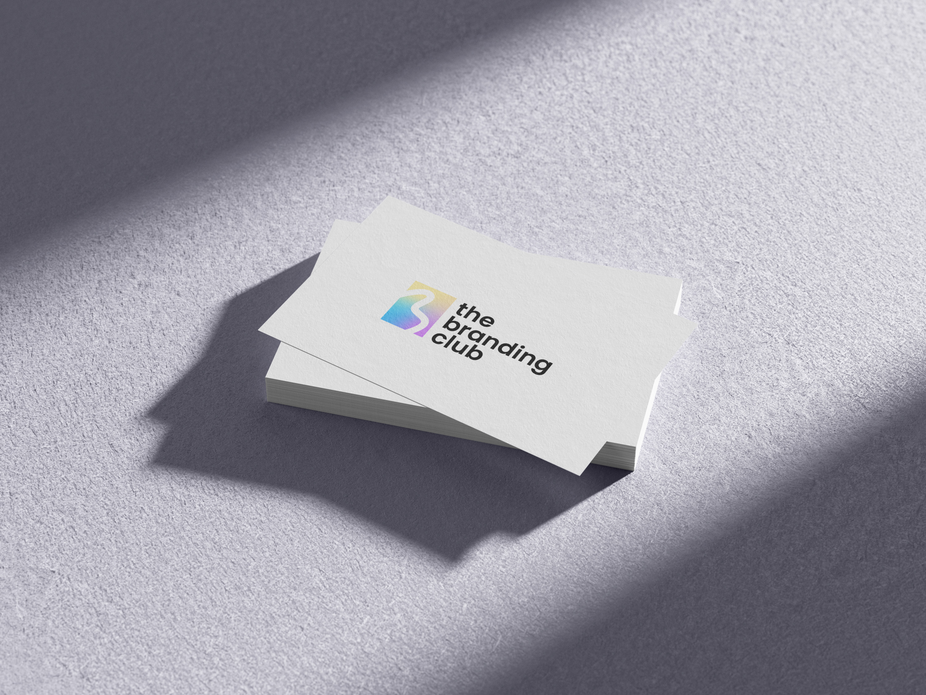
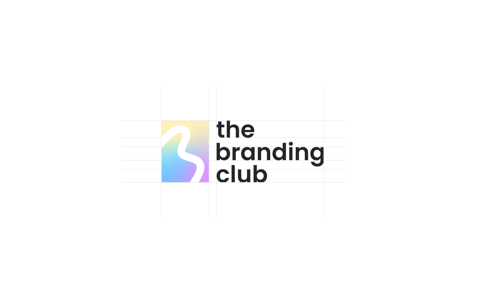
The logo concept was built around making creativity tangible. A pencil-inspired stroke forms the basis of the mark, referencing the act of creating rather than a finished outcome.
A subtle color gradient adds depth and movement, reinforcing the idea of exploration and iteration. Together, these elements position the brand as one that values process, experimentation, and craft.
Exploring variation to find the right fit
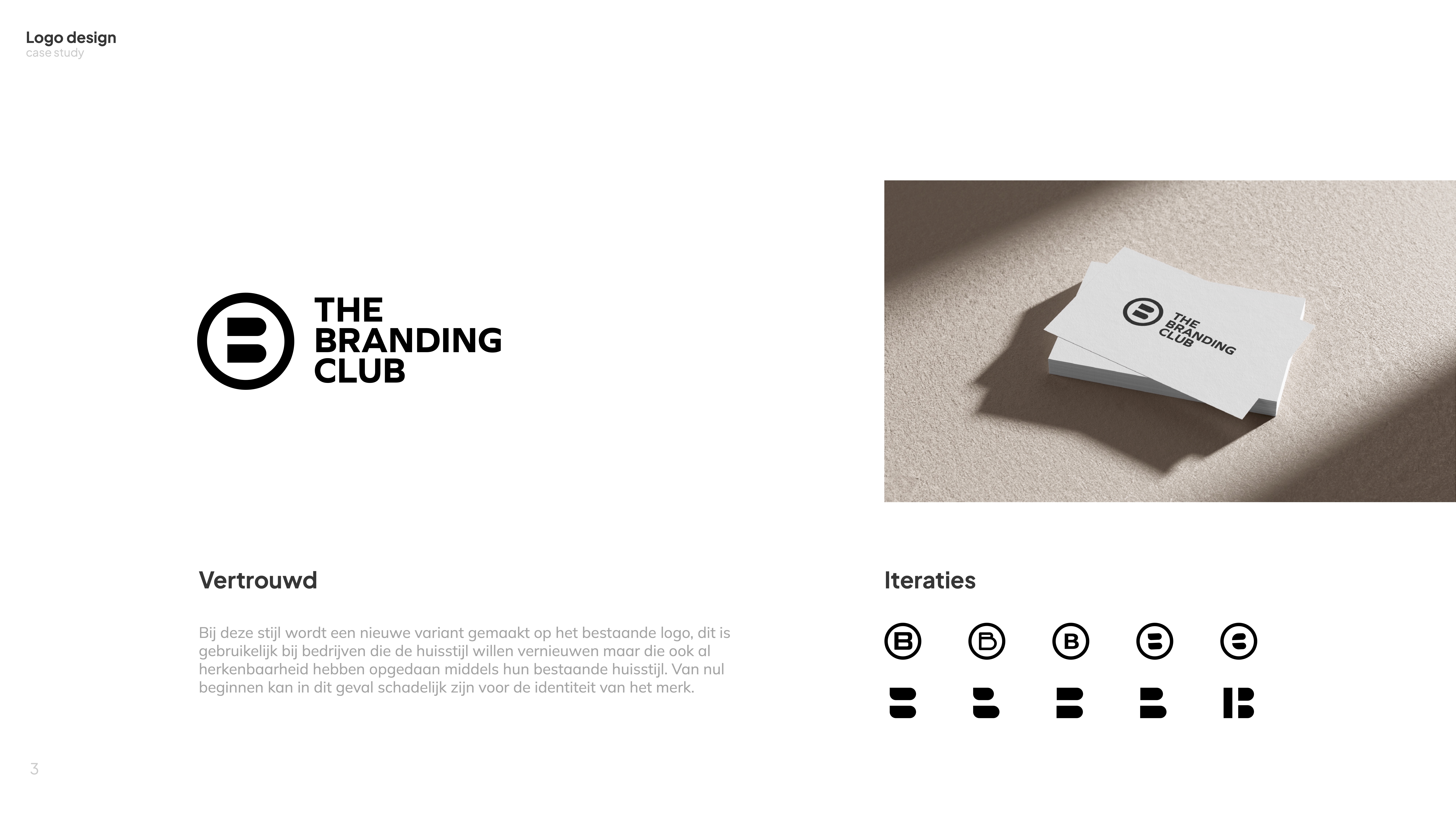
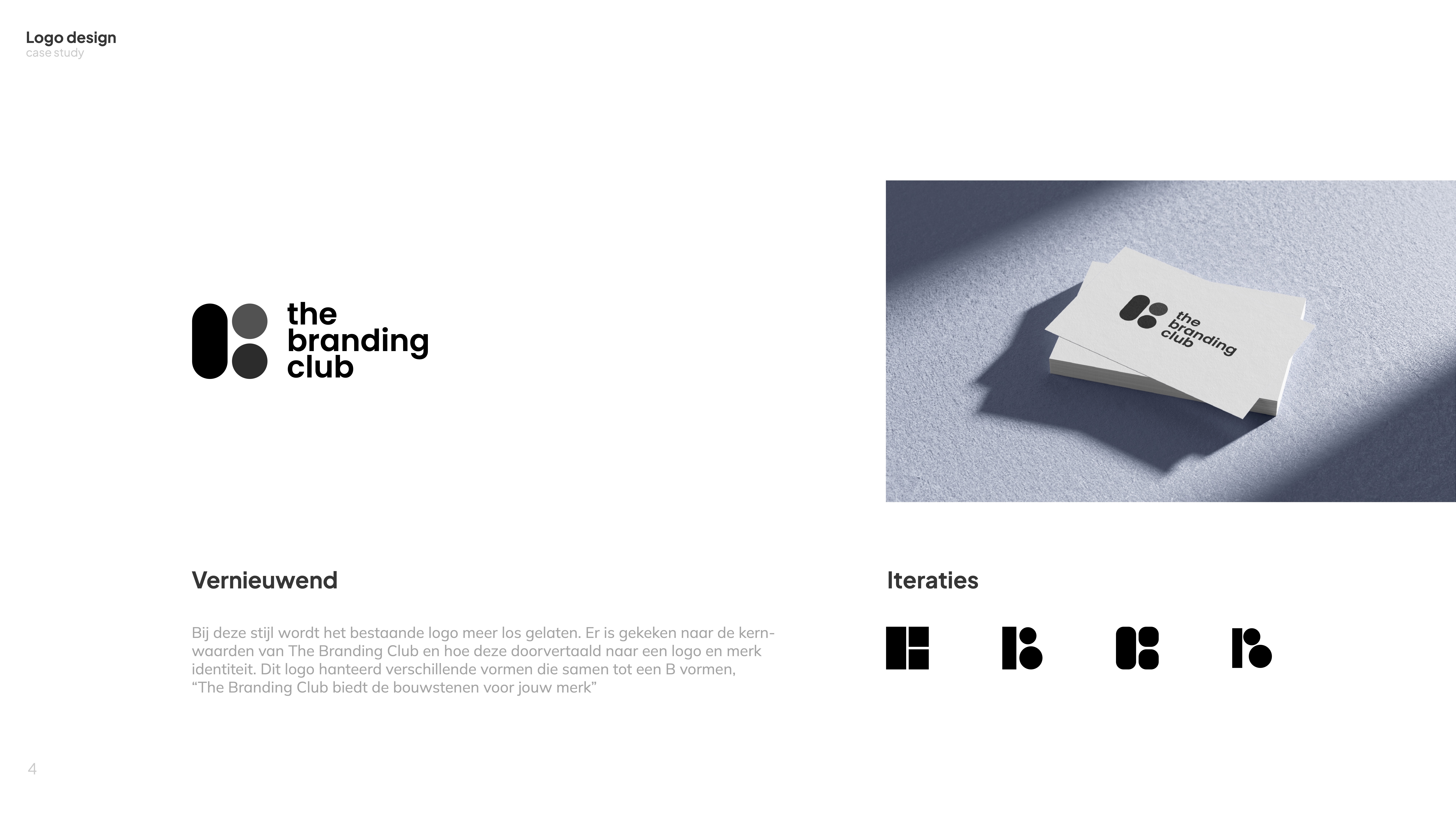
Because a logo is the most recognizable and long-lasting element of a brand, the process focused on exploration before refinement.
Multiple visual directions were developed early on to test how different styles aligned with the studio’s identity and use cases. This allowed for informed decision-making and ensured the final logo could adapt across digital, print, and promotional contexts without losing its character.
