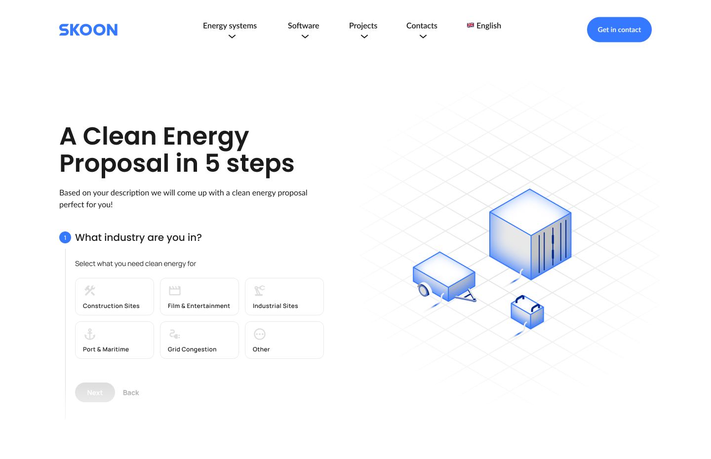
Making complex technology approachable
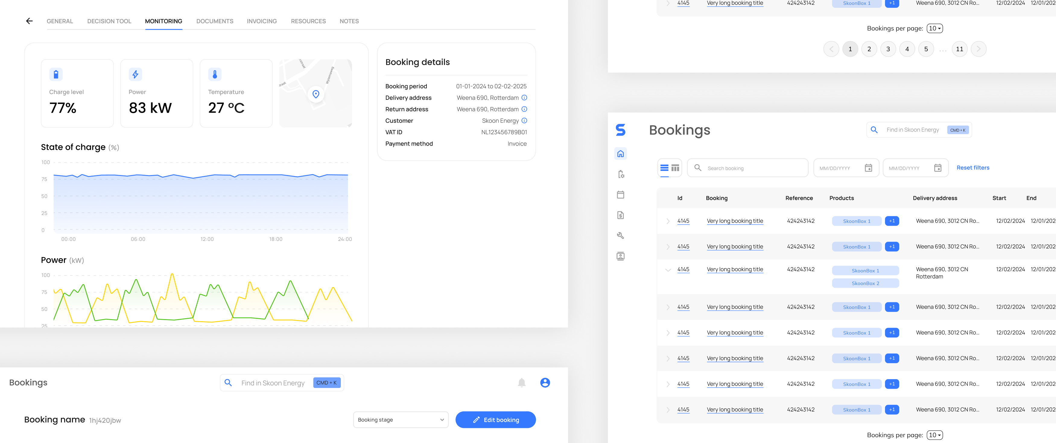
Skoon’s platform had been built by a strong engineering team and had already proven its value. However, usability and visual consistency had not yet caught up with the technical depth of the product.
The interface lacked a clear hierarchy, interaction patterns varied across platforms, and the overall look and feel didn’t reflect Skoon’s ambition to become a credible new player in the energy market. This created friction for users and made it harder to confidently communicate the product’s value beyond a technical audience.
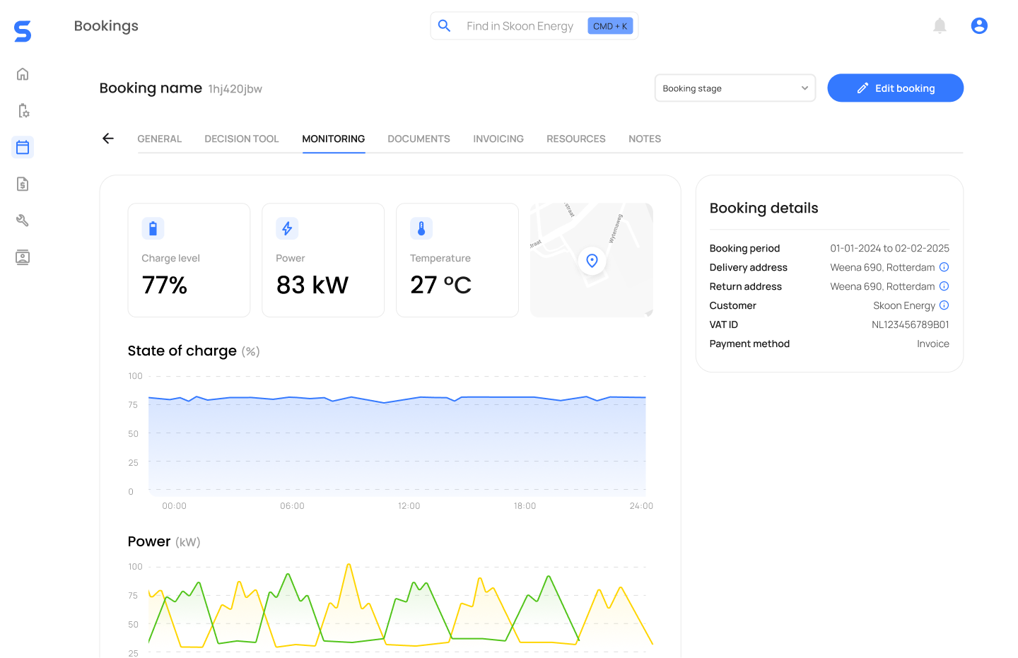
A coherent system instead of a cosmetic redesign
Rather than treating this as a visual refresh, the focus was on creating a foundation that could support both usability improvements and future growth.
I introduced a new visual identity that balanced clarity and confidence, paired with interaction principles designed to reduce cognitive load in complex workflows. The goal was to make the product feel understandable without oversimplifying the underlying technology, and credible without relying on heavy visual decoration.
This direction positioned design as a structural part of the product, not just a surface layer.
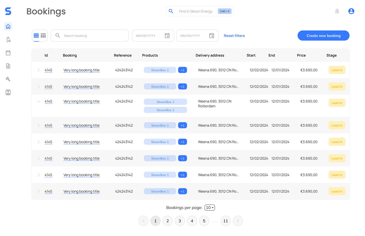
Aligning brand, UX, and development
To ensure consistency across platforms and features, I created a shared design library that combined visual styles, components, and interaction patterns into a single system.
This allowed design decisions to scale beyond individual screens and made it easier for developers to implement new features without reintroducing inconsistency. UX improvements were introduced incrementally, fitting into existing development cycles rather than requiring disruptive redesigns.
As a result, design became embedded in the product workflow, helping reduce ambiguity, speed up implementation, and maintain a coherent experience as the product evolved.