Rebranding without overshadowing the products
Avanas’ existing visual identity no longer reflected the professionalism expected in the PPE market. At the same time, Avanas does not sell its own products, but represents multiple international brands.
The challenge was to create a brand that felt modern and trustworthy, while remaining neutral enough to support and showcase the brands Avanas distributes rather than competing with them.
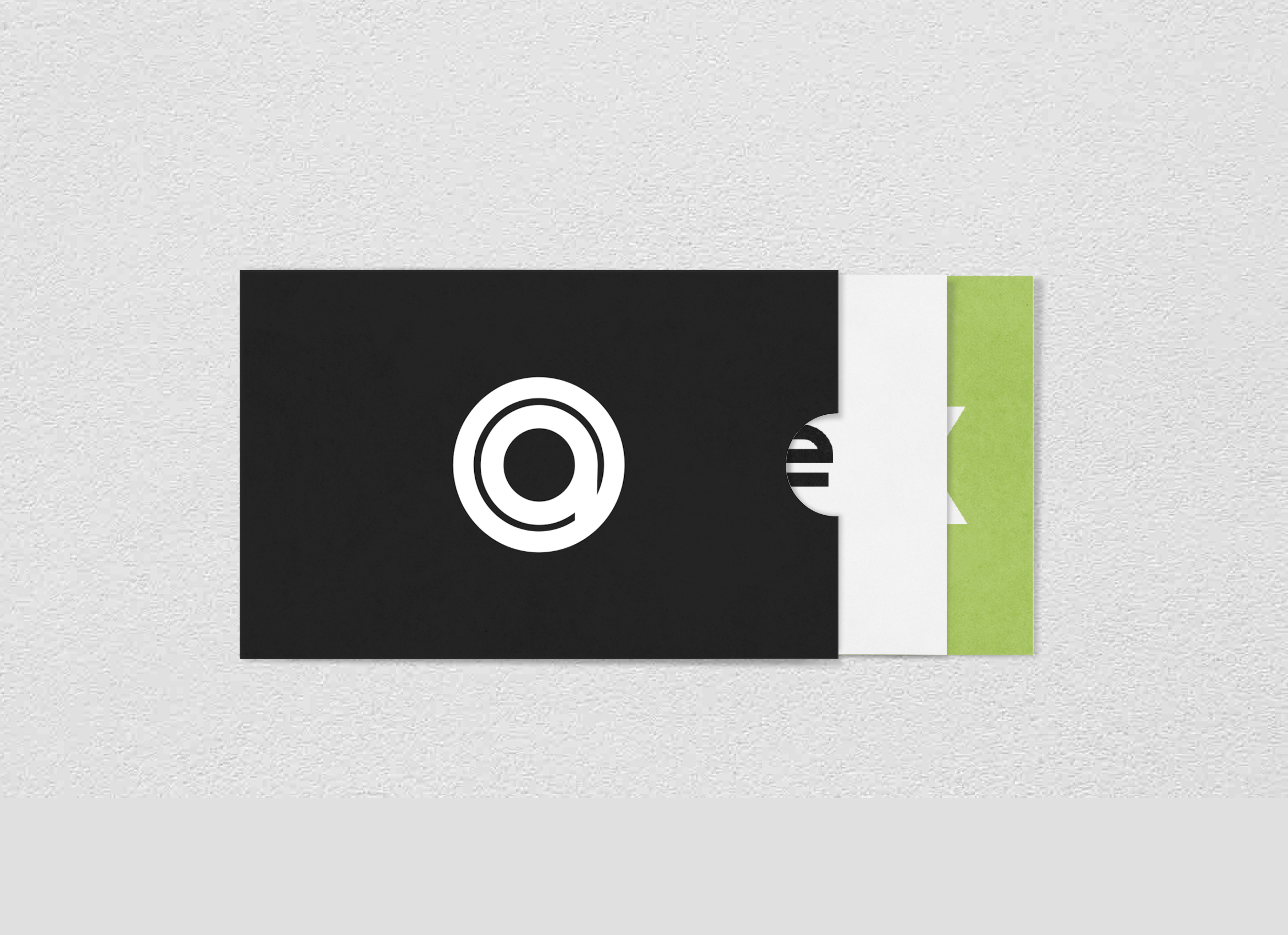
A quiet, supportive brand
Instead of a bold or expressive identity, the new direction positioned Avanas as a reliable intermediary. The brand needed to communicate safety, clarity, and professionalism without drawing attention away from the products themselves.
This meant designing an identity that could sit comfortably alongside a wide range of external brand styles and adapt across marketing and sales materials.
Neutral design as a strategic choice
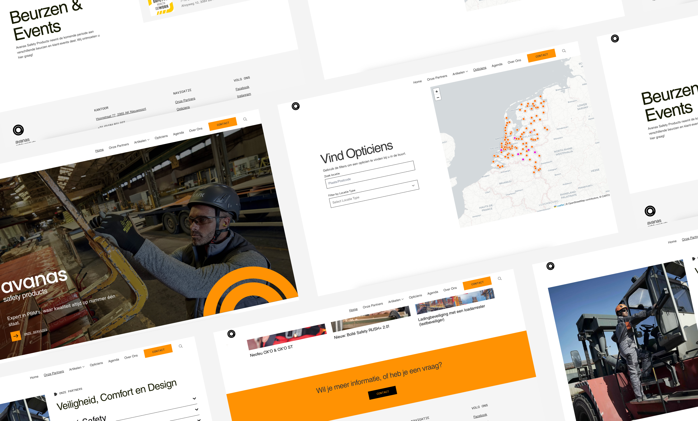
The visual identity was built around a simple logo and restrained color palette, creating a clean and modern foundation. On the website and in printed materials, the visual language of the represented brands was intentionally given space to lead.
By keeping Avanas’ own branding understated, the system allows partner brands to gain visibility while maintaining a consistent and professional presentation across touchpoints. The result is a flexible identity suited to the expectations and realities of the PPE market.